Vibe Magazine
Masthead of the contents page:
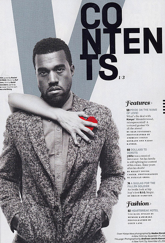
There is a large
letter ‘V’ which stands for the magazines title, which is ‘Vibe’. The ‘V’ is always
present on all Vibe Magazine covers and content pages, and usually is placed on
the top of the page in order to keep consistency within the product. The
consistency makes the magazine look more professional which means that more
people are likely to purchase the magazine; also it makes the magazine more recognisable
just by using the letter ‘V’. A lot of the content pages from ‘Vibe’ use a
grayscale colour scheme, which although not eye – catching, makes the magazine
seem more elegant in the design therefore making more people purchasing the magazine
week in week out.
The dominant image:
The dominant image
is an image of Kanye West with an arm over his shoulder. The hand is holding a
red heart, which is the only colour on the page which helps draw the eye of the
reader. The hand holding the hand could mean that women are trying to win his
heart. The image dominates the page and will help bring in his target audience
as well as their own, as his music is in the same genre as the magazine which
means that they will have a similar target audience. He is looking straight
into the camera, with an angry expression; which could associate with rap music
due to the connotations of rebellion of the genre. Kanye is the main image on
the contents page and the front cover which means that he is the main article
in the magazine, therefore meaning people will purchase the magazine in order
to read about him, he is also smartly dressed which helps make the magazine
look elegant with the colour scheme.
The word contents:
The word content is
written in a large black font that stands out from the rest of the background,
which makes it seem original and eye catching. Like with the masthead most of
the Vive issues have the word contents written like this helps with the
consistency of the product.
Subheading:
As well as the word contents the subheadings are written in large black writing which helps show the audience where the main areas of interest are on the page, under features and fashion. The font that has been used is fancy, which again links with the elegant style of the colour scheme and Kanye’s clothes, but it also makes the contents page look more interesting.
As well as the word contents the subheadings are written in large black writing which helps show the audience where the main areas of interest are on the page, under features and fashion. The font that has been used is fancy, which again links with the elegant style of the colour scheme and Kanye’s clothes, but it also makes the contents page look more interesting.
Articles;
They are placed
under the subheading which shows the category that they will be under; they show
the reader the main parts of the magazine and what pages they are located on.
The font colour is grey, which makes them stand out from the subheading but
keeps them to the colour scheme and the elegant style that they are.


No comments:
Post a Comment